Animations in React Native: Performance and Reason-about-ability with Reanimated 2

If you're reading this, I don't think I have to convince you that React Native is pretty great: it drastically simplifies the mental model of cross-platform mobile application development. Developers can use a single codebase to generate native iOS and Android apps, allowing them to focus primarily on application code and very little on platform-specific APIs and quirks. Furthermore, React Native (which we'll refer to as RN in this piece) is underpinned by React, which has proven to be a powerful model for reasoning about dynamic UIs. RN helps us developers simplify the mental model needed to reason about building cross-platform mobile UIs, freeing up more mental space for the important stuff: business models and building pleasant and useful application experiences.
Even with a simplified model for building cross-platform mobile UIs, mobile app development is still hard. There are many challenges to overcome such as navigation, permissions, push notifications, smooth animations, and gestures, and so on. The upside is this: the RN ecosystem is now quite strong, and there are a lot of good libraries and tools out there to help us tackle these hard problems in ways that—like RN—help us simplify our mental models so that we don't become bogged down with platform APIs and differences between Android and iOS.
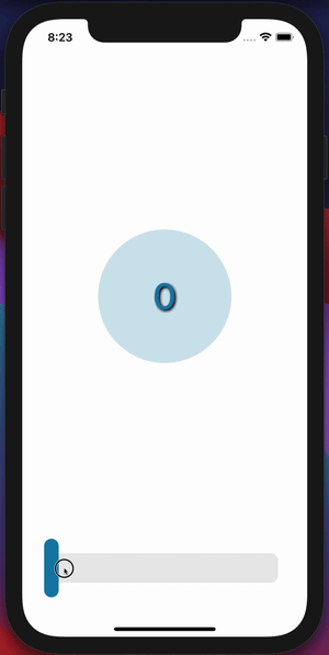
In this article, I'm going to discuss one of the aforementioned challenges of mobile app development with RN—building smooth animations and gestures—and a tool in the RN ecosystem, React Native Reanimated, that helps us take on this challenge without fear. While discussing building smooth animations and gestures with a simplified mental model, we'll build out a sample UI that's potentially not that useful, but showcases a lot of animation and gesture techniques we'll be developing with this new tool. To whet your appetite a bit, here's a teaser of what we'll building:
Animation in React Native
One of the beauties of RN is that we can write our application code in JavaScript and somehow we end up with native application artifacts. There's some magic in RN—it actually ships a JS engine that runs your JS code on its own thread—and then communicates to a native thread via a "bridge". Here's a very simplified diagram to help us think about this:
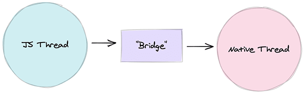
Your JS code is executed on the left, RN passes information through this magical "bridge", and native things are executed on the native thread.
Generally, this works quite well! We often don't have to remember that there's this magical "bridge" thing there—we just write JS and create awesome applications. But you might be thinking to yourself: "What's the performance cost of passing through this bridge? Surely it can't be quite as efficient as just writing raw native code." The performance cost is non-zero but generally small enough that users aren't going to notice.
However, there are certain aspects of an application where users are surely going to notice when performance is taking a hit. One of those aspects is animation. Once you start dropping under 60 frames per second (fps) for animations and start "dropping frames", attentive users will likely notice, and start wondering why your application feels "choppy" or "laggy".
It turns out, creating smooth (60fps) animations while living only in the land of JS can be quite challenging. Luckily, RN ships with some animation tools (https://reactnative.dev/docs/animated), and those tools can be used to create some smooth animations. RN's Animated API helps you declare animations in JS, and then push your animation declarations to the native UI thread for execution. However, there are certain limitations to what you can do with RN's Animated API, how much performance you can get out of it, and how easy it is to reason about.
In an ideal world, we’d have a tool that allows us to create animations that:
- run primarily on the native UI thread;
- are written declaratively in JS;
- and allow us to largely forget about "the bridge".
Such a tool would allow us to simplify our model of animation while allowing us to remain confident our animations are performant enough to feel buttery smooth.
Introducing React Native Reanimated (Version 2)
That tool that's going to help us build smooth animations and gestures while keeping our mental model of animation slim? That's React Native Reanimated Version 2. I'll be referring to Version 2 of this library as "Reanimated 2" or just "Reanimated". It's worth pointing out that V2 of Reanimated is a huge overhaul of the library, and the API is drastically different from V1 (and in a good way).
So what is Reanimated? It's a library that replaces RN's Animated API, providing JS-based animation APIs that are easy to use and run on the native thread (which entails performance out of the box).
For the rest of this post, I'm going to be walking through some of the core APIs of Reanimated, how I have been thinking about them, and provide some examples to demonstrate some of these ideas. The end result will be a custom slider, and a circular progress that animates as you drag the slider handle.
The "Reanimated Mental Model"
Before we get too deep into Reanimated, I want to share my mental model for animating with Reanimated. I think of Reanimated as the intermediary between JS-based app code and native-thread animation execution. Here's a little diagram of that thinking:
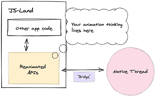
In the back of my head, I know that my animation code must play nicely with both JS code and native code, but that Reanimated will abstract away a lot of the dirty details for me. The Reanimated primitive that does this dirty-detail-abstraction is a worklet. Worklets, according to the Reanimated docs, are
tiny chunks of JavaScript code that can be moved to a separate JavaScript VM and executed synchronously on the UI thread.
Basically, worklets are just JS functions that get executed on the UI thread (magic!) which allows us to define native-level animation commands in JS without worrying about the cost of the bridge. This is insanely powerful, but also still a bit hard to reason about. One of the beauties of Reanimated is that the library largely abstracts away the notion of worklets by providing us with a handful of useful React hooks to define animations. We'll get our hands dirty with a custom worklet, but we'll largely focus on said hooks, as they'll be the bread and butter of using Reanimated to define animations.
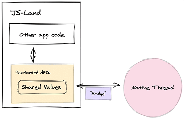
Shared Values
In my mental model of animating with Reanimated, the core concept is the shared value. A "shared value" is essentially a simple primitive value on the JS-side of things, but can be used to drive animations on the UI-side of things. We can update shared values on the JS side and see these changes reflected on the UI thread.
Back to our diagram of our mental model for animation with Reanimated, a "shared value" sits in that sweet spot between JS-code and UI-thread execution.
Let's look at a really simple example of creating a shared value:
import * as React from "react";
import { Button } from "react-native";
import { useSharedValue } from "react-native-reanimated";

const MyComponent: React.FC = () => {
  const x = useSharedValue(0);

  return <Button title="Increment x" onPress={() => (x.value += 1)} />;
};
Whenever you hit the button, the shared value gets incremented! This is illustrative of how to create a shared value, but these shared values aren't of much use to us until we actually use them. Let's dig into some tools for actually using our shared values to make things move.
Animated Styles
When we think of animation, we generally think of animating various styles. Reanimated gives us a useAnimatedStyle hook that allows us to animate styles using shared values. Let's look at an example:
import * as React from "react";
import { Button } from "react-native";
import Animated, {
  useSharedValue,
  useAnimatedStyle
} from "react-native-reanimated";

const MyComponent: React.FC = () => {
  const x = useSharedValue(0);

  const boxStyle = useAnimatedStyle(() => {
    return {
      width: 100,
      height: 100,
      backgroundColor: "red",
      // Animate translateX
      transform: [{ translateX: x.value }]
    };
  });

  return (
    <View>
      <Button title="Increment x" onPress={() => (x.value += 1)} />
      <Animated.View style={boxStyle} />
    </View>
  );
};
In this code snippet, we use useAnimatedStyle to create a style that is dynamic based on our shared value, x. We pass that animated style to Animated.View, and as we press our button, the little square will move across the screen (albeit in a "choppy" manner).
"Animating" our Slider Handle
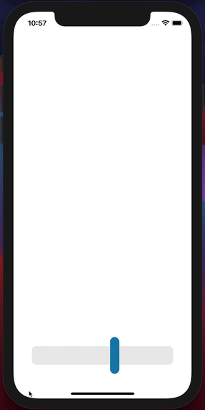
Let's finally dig into our slider/circular progress example. We'll create a custom "slider" of sorts. To start, we'll just build out the UI and showcase how to use shared values and animated styles to move our slider's handle around. Here's the start to our slider component:
import * as React from "react";
import Animated, {
  useAnimatedStyle,
  useSharedValue
} from "react-native-reanimated";
import { COLOR } from "../consts";
import { View } from "react-native";

const HANDLE_WIDTH = 20;

/**
 * Custom slider control that uses gesture handlers
 */
export const Slider: React.FC = () => {
  // Shared values
  const sliderWidth = useSharedValue(0);
  const progress = useSharedValue(0);

  /**
   * Animated style for handle, translated based on progress.
   */
  const animatedHandleStyle = useAnimatedStyle(() => {
    return {
      transform: [{ translateX: progress.value - HANDLE_WIDTH / 2 }]
    };
  });

  // For illustrative purposes, we'll update progress on an interval.
  React.useEffect(() => {
    const interval = setInterval(() => {
      progress.value = Math.random() * sliderWidth.value;
    }, 1000);

    return () => {
      clearInterval(interval);
    };
  }, []);

  return (
    <View
      style={{
        flex: 1,
        backgroundColor: "rgb(234,234,234)",
        justifyContent: "flex-end",
        borderRadius: 10
      }}
      onLayout={e => {
        sliderWidth.value = e.nativeEvent.layout.width;
      }}
    >
      <Animated.View
        style={[
          {
            width: HANDLE_WIDTH,
            backgroundColor: COLOR,
            borderRadius: 10,
            position: "absolute",
            bottom: -20,
            top: -20
          },
          animatedHandleStyle
        ]}
      />
    </View>
  );
};
There is some wrapping code for styling the app's display, but the above code snippet produces something like this:
There are a few things we should note about the code here:
- We have two shared values,
progressandsliderWidth. We'll be primarily focused onprogress, butsliderWidthwill be used to keep track of the slider's width (which we measure withonLayout). - We created an animated style,
animatedHandleStyle, that translates our handle horizontally. This is what's responsible for moving our handle around on the slider track. - For illustrative purposes, we just created a
useEffectto update theprogressshared value on an interval. Roughly every second, the handle will move to a random spot on the slider track.
Now, you're probably looking at the above GIF and thinking, "that thing isn't really animating, is it? It's just periodically moving in a choppy manner." Well, you're right. This admittedly isn't very pretty or smooth—but that's our fault, not Reanimated's. We're just periodically changing the progress value, and not animating the progress value. Let's look more in-depth at the APIs Reanimated exposes for making our animations smoother.
"Easing" into Things
Reanimated gives us some tools to actually animate shared values with various easing functions. With functions like withTiming, withSpring, and withDelay—all functions that ship with Reanimated—we can start to compose smooth animations in a declarative way.
You can check out these functions in the docs, but they generally behave in predictable ways. You can update a shared value using one of these functions, and that shared value will animate based on your configuration. Here's a simple example:
import * as React from "react";
import { Button } from "react-native";
import { useSharedValue, withTiming } from "react-native-reanimated";

const MyComponent: React.FC = () => {
  const x = useSharedValue(0);

  const onPress = () => {
    x.value = withTiming(200, { duration: 200 });
  };

  return <Button title="Increment x" onPress={onPress} />;
};
Here, our onPress function animates our shared value x to a value of 200 with a timing function. It's a pretty small change, but it makes it so our shared value is animating between values (and not just "jumping" from one value to another). Okay, let's revisit our slider example and put this to work.
Actually Animating our Slider Handle
In our previous slider example, our slider handle choppily jumped around. Let's go ahead and smooth that out. We'll just make a small tweak to our interval callback from before:
const interval = setInterval(() => {
  // Replace this...
  // progress.value = Math.random() * sliderWidth.value;

  // With this...
  progress.value = withSpring(Math.random() * sliderWidth.value);
}, 1500);
This is where Reanimated really starts to shine! With that tiny change in place, we end up with something like the following.
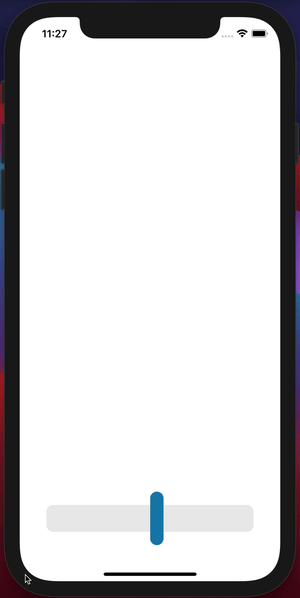
Our handle is now animating to different positions with spring motion! We could also configure various physics properties of our spring animation if we were so inclined. We could have also used withTiming and configured our easing explicitly—it's all up to you, and what you're trying to achieve!
Animated Gestures
Animations alone are a pretty great way to add some polish to a mobile app. However, most users now expect a certain level of gesture support in mobile applications (think: swipe down to dismiss, pinch to zoom, etc.). These gestures generally go hand-in-hand with animations because as the user is performing a gesture, the app generally animates some aspect of the UI to provide the user feedback that a gesture is being registered and handled as expected.
Gestures and animations can be quite intimidating. However, Reanimated provides some incredibly useful hooks for creating gesture handlers, which can be provided to gesture handler components from the library react-native-gesture-handle (https://docs.swmansion.com/react-native-gesture-handler/docs/) to register our gesture handlers. This combination makes gesture/animation handling quite friendly!
Reanimated provides a useAnimatedGestureHandler hook that allows us to declaratively configure a gesture handler, and then we can provide that handler to a gesture handler component from react-native-gesture-handler. This is best described with an example, so let's improve our slider so that the handle can be dragged (like you would expect from a slider).
Adding Gesture Support to our Slider
Let's continue our previous slider work, but swap out just a couple things. We'll get rid of our useEffect that was periodically changing the progress value to a random value, and replace it with a gesture handler. Then we'll register our gesture handler inside of our JSX via a PanGestureHandler component. Here's the code:
import ...
import { PanGestureHandler } from 'react-native-gesture-handler';

/**
 * Custom slider control that uses gesture handlers
 */
export const Slider: React.FC = () => {
  // Shared values
  const sliderWidth = useSharedValue(0);
  const progress = useSharedValue(0);

  /**
   * Animated style for handle, translated based on progress.
   */
  const animatedHandleStyle = useAnimatedStyle(...);

  /**
   * Create animated handler for pan gesture.
   */
  const panGestureHandler = useAnimatedGestureHandler<
    PanGestureHandlerGestureEvent,
    { startProgress: number }
  >({
    // On start, make note of the progress value at start of gesture.
    onStart: (_, ctx) => {
      ctx.startProgress = progress.value;
    },
    // On pan, new progress is the starting progress plus change in position
    onActive: (event, ctx) => {
      progress.value = ctx.startProgress + event.translationX;
    },
    // On pan-end, snap back to 0 or sliderWidth if out of bounds.
    onEnd: () => {
      if (progress.value > sliderWidth.value) {
        progress.value = withSpring(sliderWidth.value);
      } else if (progress.value < 0) {
        progress.value = withSpring(0);
      }
    },
  });

  return (
    <View
      style={{ ... }}
      onLayout={...}
    >
      <PanGestureHandler onGestureEvent={panGestureHandler}>
        <Animated.View style={...} />
      </PanGestureHandler>
    </View>
  );
};

const HANDLE_WIDTH = 20;
With these changes in place, we now have gesture support! We can drag our handle like you'd expect from a slider.
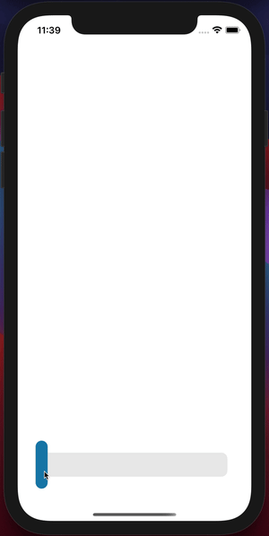
We need to dig into some of this code, though. The useAnimatedGestureHandler hooks allow us to configure our gesture handler based on various lifecycle hooks for the gesture, such as onStart, onActive, onEnd, and so on. The handler has a context object that we can use to pass information between the different lifecycle methods, which is quite useful for stateful gestures. Let's check out the lifecycle callbacks of the gesture handler we configured here.
To start, we have this onStart callback configured:
onStart: (_, ctx) => {
  ctx.startProgress = progress.value;
},
This might look a bit strange at first, but the onStart callback exposes a context object that we can tack information to. In this case, when the user starts to pan the handle, we attach the current progress value (or the progress value at the start of the pan) to the context object. We're going to need that later for some maths! Other than attaching this progress value to the context, we're not doing anything when the user starts the pan.
Next, we have the onActive callback configured:
onActive: (event, ctx) => {
  progress.value = ctx.startProgress + event.translationX;
},
This callback is called as the user is actively panning. This callback exposes an event object, as well as the previously mentioned context object. The event object will tell us how much the user has panned since the start via the event.translationX property. To determine the new progress value, we take the starting progress value and add to it the amount by which the handle's horizontal position has changed (e.g., (final value) = (starting value) + (change in value) ). This is technically all we need for our slider handle to move according to our pan gesture!
We're going to add a little bit of spice to this, though. In the previous GIF, notice how if we drag the handle past the slider track, it'll spring back? We configured that with the onEnd callback here:
onEnd: () => {
  if (progress.value > sliderWidth.value) {
    progress.value = withSpring(sliderWidth.value);
  } else if (progress.value < 0) {
    progress.value = withSpring(0);
  }
},
The logic here isn't too complicated: if the progress value ends up greater than the width of the slider, spring it back to the slider width value; if the progress value ends up less than zero, spring it back to zero.
Bam! Take a step back, and acknowledge how (relatively) straight-forward that was! Reanimated provides us with tools to declaratively create some really delightful gestures and interactions. Now, let's look at one more trick Reanimated has up its sleeve: That's the ability to animate native props (beyond just styles)!
Animated Props
Things keep getting better. Reanimated allows us to animate arbitrary props on the UI thread via a useAnimatedProps hook. From the docs:
This hook is a counterpart of
useAnimatedStylehook, but works for non-style view properties. It allows for defining a set of native view properties that can be updated on the UI thread as a response to a Shared Value change.
You might be wondering what sort of non-style props we might want to animate. Turns out, there are some really cool effects that can be achieved by animating non-style props on things like SVG (from react-native-svg) and other native elements like TextInput .
The TL;DR for animated props is this: you create some animated props with the useAnimatedProps hook, and then pass that object to the animatedProps prop of an animated component. Let's illustrate with a real example.
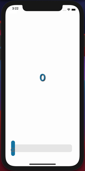
Animating Progress Text Display
We're going to start building out our "circular progress" display (see the first GIF in this post to see the end result). This circular progress component is going to need access to the shared values we've already defined (progress and sliderWidth). Our component structure is going to look something like App > CircularProgress + Slider where our App component will hold the shared values and pass those down to our CircularProgress and Slider components as props.
Let's start our CircularProgress component by creating some text that represents the percentage of the handle progress along the slider track, e.g., if the handle is half-way across the slider track, the text will say "50". The end result of this step will be this:
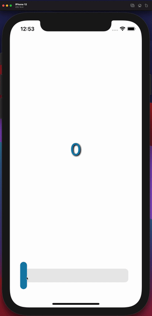
Our code for the CircularProgress component will look like this:
import * as React from "react";
import Animated, {
  interpolateColor,
  useAnimatedProps
} from "react-native-reanimated";
import { Circle } from "react-native-svg";
import { StyleSheet, TextInput, View } from "react-native";
import { clamp } from "../utils/clamp";
import { COLOR } from "../consts";

/**
 * Make TextInput animatable!.
 * TextInput is not animatable by default.
 */
const AnimatedInput = Animated.createAnimatedComponent(TextInput);

type CircularProgressProps = {
  progress: Animated.SharedValue<number>,
  sliderWidth: Animated.SharedValue<number>,
  radius?: number
};

export const CircularProgress: React.FC<CircularProgressProps> = ({
  progress,
  sliderWidth,
  radius = 100
}) => {
  /**
   * Animated input props
   */
  const animatedInputProps = useAnimatedProps(() => {
    // Determine the percent complete.
    const percentComplete = clamp(progress.value / sliderWidth.value, 0, 1);

    return {
      // The text value
      text: `${Math.round(100 * percentComplete)}`,
      // The color of the text.
      color: interpolateColor(
        percentComplete,
        [0, 0.5, 1],
        [COLOR, COLOR, "white"]
      )
    };
  });

  return (
    <View>
      <View style={{ width: radius * 2, height: radius * 2 }}>
        <AnimatedInput
          editable={false}
          defaultValue="0"
          style={[
            StyleSheet.absoluteFill,
            {
              fontSize: radius / 2,
              fontWeight: "500",
              textAlign: "center",
              textShadowColor: "black",
              textShadowOffset: { width: 2, height: 2 },
              textShadowRadius: 4
            }
          ]}
          animatedProps={animatedInputProps}
        />
      </View>
    </View>
  );
};
There's quite a bit to take in here—but this is a nice strategy for animating a number-display through values. Basically, we'll use a disabled TextInput component, and animate its text prop, which creates a nice animation. Let's check out what's going on with this code.
First, notice this bit:
const AnimatedInput = Animated.createAnimatedComponent(TextInput);
RN's TextInput component isn't animatable by default, so we need to make it animatable using Reanimated's createAnimatedComponent method. This allows us to pass animated props or styles to this component.
Next, we'll see the important part of this example—the part where we declare how to animate the props:
const animatedInputProps = useAnimatedProps(() => {
  // Determine the percent complete.
  const percentComplete = clamp(progress.value / sliderWidth.value, 0, 1);

  return {
    // The text value
    text: `${Math.round(100 * percentComplete)}`,
    // The color of the text.
    color: interpolateColor(
      percentComplete,
      [0, 0.5, 1],
      [COLOR, COLOR, "white"]
    )
  };
});
In this snippet, we determine the percentComplete of the progress. There's a custom clamp "worklet" (more on that in a bit) that clamps a given value between two other values—so in this case, never let the percentage be less than 0 or more than 1. Then, we return some props that we want to animate. We'll animate the text property based on the percentage, and we'll animate the color of the TextInput using the percentage. We'll loop back around to the interpolateColor function a bit later, but for now, just know that it's allowing us to animate the color of the text from our declared COLOR (which is blue-ish) to white based on the percentage.
Once we've created some animated props, we just need to pass those to our animated component:
<AnimatedInput
  editable={false}
  defaultValue="0"
  style={...}
  animatedProps={animatedInputProps}
/>
This is enough to make our progress number animate!
Animating our Progress Circle
Okay, so at this point we have our custom slider, and a number-display that represents our slider handle's progress. Let's polish this animation off with a "circular progress" indicator—something that looks like the stroke of a circle being drawn around it. There are a few ways to do this, but we're going to use an SVG circle and tweak its strokeDasharray and strokeDashoffset to create the look we're going for. The approach goes something like this:
- Determine the circumference of the circle, call it
CIRCUMFERENCE. - The
strokeDasharrayproperty of an SVG path represents the "dash pattern" of its stroke. If we set thestrokeDasharrayof the<Circle />element toCIRCUMFERENCE, it means we'll have one dash that wraps around the whole circle. - The
strokeDashoffsetproperty of an SVG path represents the offset of the "dash pattern" of its stroke, so astrokeDashoffsetof5makes the "dash pattern" of the stroke start 5 units later than it normally would. If we animate thisstrokeDashoffsetproperty, we can make it appear like our circle's stroke is drawing out the perimeter of the circle.
/**
 * Make SVG Circle animatable.
 */
const AnimatedCircle = Animated.createAnimatedComponent(Circle);

export const CircularProgress: React.FC<CircularProgressProps> = ({
  progress,
  sliderWidth,
  radius = 100,
  strokeWidth = 10,
}) => {
  // Derived values
  const CIRCUMFERENCE = 2 * Math.PI * radius;
  const HALF_WIDTH = radius + strokeWidth;

  // Animated input props
  const animatedInputProps = useAnimatedProps(...);

  /**
   * Animated progress props. Animate strokeDashOffset to handle animation
   */
  const animatedProgressProps = useAnimatedProps(() => {
    const percentComplete = clamp(progress.value / sliderWidth.value, 0, 1);
    return {
      strokeDashoffset: (1 - percentComplete) * CIRCUMFERENCE,
    };
  });

  return (
    <View>
      <View style={{ width: radius * 2, height: radius * 2 }}>
        <Svg
          width={radius * 2}
          height={radius * 2}
          viewBox={`${-HALF_WIDTH} ${-HALF_WIDTH} ${2 * HALF_WIDTH} ${
            2 * HALF_WIDTH
          }`}
        >
          <G rotation="-90">
            {/* Progress */}
            <AnimatedCircle
              cx={0}
              cy={0}
              r={radius}
              fill="transparent"
              strokeWidth={strokeWidth}
              strokeLinecap="round"
              strokeDasharray={CIRCUMFERENCE}
              animatedProps={animatedProgressProps}
              stroke={COLOR}
            />
          </G>
        </Svg>
        <AnimatedInput {...} />
      </View>
    </View>
  );
}
This produces the following:
Again, this is kind of a lot of code to look at. But we'll follow our strategy that we outlined above.
Step 1 (from above): we start by determining the circumference of the circle we'll be creating (just a little math here).
const CIRCUMFERENCE = 2 * Math.PI * radius;
Step 2 (from above): we create an animated SVG circle, and pass some props, including a strokeDasharray with a value of the circumference of the circle.
<AnimatedCircle strokeDasharray={CIRCUMFERENCE} {...otherProps} />
And finally, Step 3 (from above): we need to animate the strokeDashoffset to make it appear like our stroke is being drawn around the circle. We'll once again use our friend useAnimatedProps to do this!
const animatedProgressProps = useAnimatedProps(() => {
  const percentComplete = clamp(progress.value / sliderWidth.value, 0, 1);
  return {
    strokeDashoffset: (1 - percentComplete) * CIRCUMFERENCE
  };
});
There is some math there that we won't get into, but this outlines a pretty friendly approach to animating a circular progress indicator!
Let's add just a tiny bit of flavor to this circular progress indicator, and add a background whose opacity animates as the progress value changes. All we'll do is add another animatable SVG circle, and animate its fillOpacity prop!
export const CircularProgress: React.FC<CircularProgressProps> = ({
  progress,
  sliderWidth,
  radius = 100,
  strokeWidth = 10,
}) => {
  // Derived values
  const CIRCUMFERENCE = 2 * Math.PI * radius;
  const HALF_WIDTH = radius + strokeWidth;

  // Animated input props
  const animatedInputProps = useAnimatedProps(...);

  // Animated progress props. Animate strokeDashOffset to handle animation
  const animatedProgressProps = useAnimatedProps(...);

  /**
   * Animated BG props. Animate color/opacity.
   */
  const animatedBgProps = useAnimatedProps(() => {
    const percentComplete = clamp(progress.value / sliderWidth.value, 0, 1);
    return {
      fillOpacity: interpolate(percentComplete, [0, 1], [0.2, 0.75]),
    };
  });

  return (
    <View>
      <View style={{ width: radius * 2, height: radius * 2 }}>
        <Svg
          width={radius * 2}
          height={radius * 2}
          viewBox={`${-HALF_WIDTH} ${-HALF_WIDTH} ${2 * HALF_WIDTH} ${
            2 * HALF_WIDTH
          }`}
        >
          <G rotation="-90">
            {/* Progress */}
            <AnimatedCircle {...progressProps}/>
            {/* Background */}
            <AnimatedCircle
              cx={0}
              cy={0}
              r={radius}
              stroke="rgb(180,180,180)"
              strokeWidth={2}
              strokeLinejoin="round"
              strokeOpacity="0.1"
              animatedProps={animatedBgProps}
              fill={COLOR}
            />
          </G>
        </Svg>
        <AnimatedInput {...inputProps} />
      </View>
    </View>
  );
};
At this point, we've arrived at our final destination!
Worklets
Along our journey, we skipped over a couple things that I'd like us to loop back to. There were a handful of spots where we saw code like this:
const percentComplete = clamp(progress.value / sliderWidth.value, 0, 1);
We didn't talk much about clamp, other than what it does. This clamp function "clamps" a value within a range (e.g., between a minimum and maximum value). Writing a basic version of this function is pretty straight-forward. It looks like this:
export const clamp = (x: number, min: number, max: number): number => {
  if (x < min) return min;
  if (x > max) return max;
  return x;
};
However, if you were to try to use that function with the code presented above, things are going to crash. That's because this is just a "plain-ol' JavaScript function", and Reanimated can't run "plain-ol' JavaScript functions" on the native thread. Remember those "worklet" things we talked about at the beginning of this post? Those are the things we need here to run some custom logic on the native thread!
Turning our existing clamp function into a "worklet" that can execute on the native thread is super simple. Are you ready? Here it is:
export const clamp = (x: number, min: number, max: number): number => {
  "worklet";
  if (x < min) return min;
  if (x > max) return max;
  return x;
};
Can you spot the difference? We literally just added the "worklet" directive to the top of the function block and Reanimated handles the rest! This magic is achieved by a babel plugin that you'll need to install when using Reanimated.
This simple example doesn't quite do these worklets justice. We can literally write code in JavaScript that will execute on the native thread! Meaning, we can execute custom animation logic on the native thread, while expressing it in JS, in a truly Reanimated fashion.
Interpolation Helpers
A core concept in animation is interpolation, which can be thought of as smartly filling in values between known values. In the land of animations, this usually looks something like:
- Mapping at least two input values to two associated output values.
- Generate the rest of the input-output pairs "in between" by linearly interpolating between the known pairs of input-output values.
Reanimated ships with an interpolate function that helps us with interpolation. One example from our journey was this:
{
  fillOpacity: interpolate(percentComplete, [0, 1], [0.2, 0.75]);
}
In this case, percentComplete varies from 0 to 1—and we're saying that we want fillOpacity to vary from 0.2 to 0.75 (in a "linear" fashion).
In a similar manner, Reanimated also ships with an interpolateColor function that allows you to interpolate between colors. This is pretty nifty, because color interpolation is quite a bit harder to reason about than interpolating with number-values!
Reality Check: It's Still Early Days
The mental model and APIs of Reanimated are great, but the reality is that, at the time of this writing, Reanimated V2 is still in its infancy as a stable release. Their docs state the following:
Reanimated 2 is in an early version. As we wanted to share it with the community as soon as we could, the library still has some rough edges and limitations that we plan to address soon.
I'm sure the team is hard at work addressing some of the rough edges, but the reality is these current rough edges have some significant impact on the developer experience. For example, the documentation also states the following about remote debugging:
Please note that Reanimated 2 doesn't support remote debugging, only Flipper can be used for debugging.
This might be a real deal-breaker if your debugger of choice is not Flipper (which is also still in relative infancy). This caution is perhaps an understatement though. Not only does Reanimated 2 not support remote debugging, it'll effectively crash your app if you use a Reanimated 2 API while the remote debugger is connected. This means that, at the moment, deciding to use Reanimated 2 forfeits your entire team from using anything other than Flipper for debugging (and I'm sure some of you have some opinions on that!).
Another hiccup I've run into is the fact that live-reload/fast-refresh doesn't work quite as intended. If you play with your development app in your simulator, then tweak some animation code, things seem to "fall out of sync" in the simulator. This isn't totally surprising to me (since live-reload updates JS code, and Reanimated lives in both JS and Native lands). This effectively requires you to do a hard-reload on the app (or some component re-mounting) whenever you make a small animation change. This isn't the end of the world, but can be a bit of a nuisance and downgrades DX a bit.
The "rough edges" of Reanimated 2 might make it hard to adopt right now, but as the team and community start to smooth out these rough edges, I believe Reanimated 2 will be a real game-changer in the animation ecosystem. I'll be patiently waiting for these rough edges to be smoothed out so that the incredible power of the Reanimated mental model and APIs can be leveraged with effectively no trade-offs!
Conclusion
Here at Formidable, we love performance and we love crisp UX, so we're quite excited to see Reanimated 2 push the RN ecosystem forward, allowing us to continue creating beautiful mobile app experiences—but hopefully with more declarative and performant animation-related code!
In this post, we discussed some core concepts in Reanimated (and for animation in RN in general), and embarked on a journey to create a little app that showcases some of these concepts and tools Reanimated provides. While this example app wasn't terribly useful, it does showcase some useful animation and gesture techniques, and how those can be applied with Reanimated.
Reanimated (Version 2) is still in its early days, and the development team acknowledges that there are some rough edges. These rough edges might deter some teams from using Reanimated 2 as their animation API of choice today, but tomorrow is looking quite bright in the space of animations in RN!