Building a Global Unified Design System
Delivering a uniform design and technology platform for commercial regions across the globe.

A Brief Overview
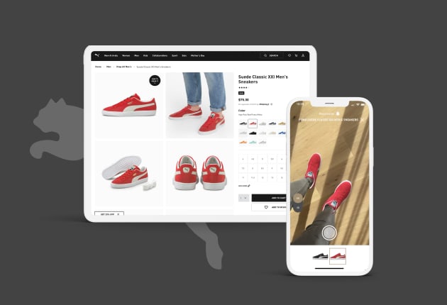
We are currently partnering with a small team from PUMA Global and created a Unified Design System to transition all independent regional websites into one e-commerce platform.
Leveling Up a Global Brand
Design partners at PUMA desire even higher levels of success across their content verticals. PUMA content across regional websites looks similar, but it’s not the same. Colors, fonts, and other small details that comprise the online experience vary from site to site. Design partners have to hunt down historical assets. There isn’t a central place where PUMA assets are stored and organized. Our team and Puma partnered in finding a solution.
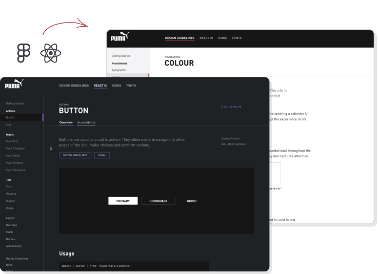
Delivering a Unified Design System To Create Consistent Experiences
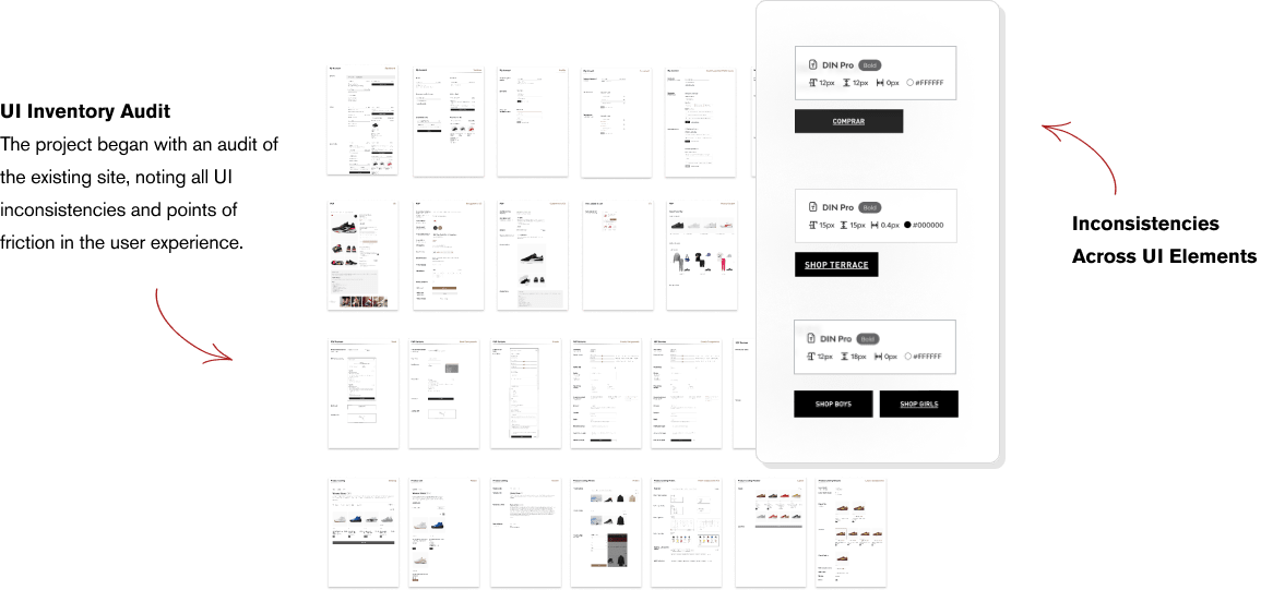
The project began with a large-scale UI inventory from the current PUMA website. Components were collected and documented, while missing components or states were noted. We then built and documented the foundational styles/tokens used to compose all components, patterns, and layouts. These included typography, spacing, color and layout, and we aligned these to the Tailwind patterns that our development team used to build out the new e-commerce platform.

Laying an Inclusive Foundation
Inclusivity was a core requirement with accessibility and internationalization built in from the beginning. All components were implemented based on WAI-ARIA authoring practices — high-contrast colors, large interactive elements, keyboard navigation — and were manually tested with screen-readers and other assistive technologies.
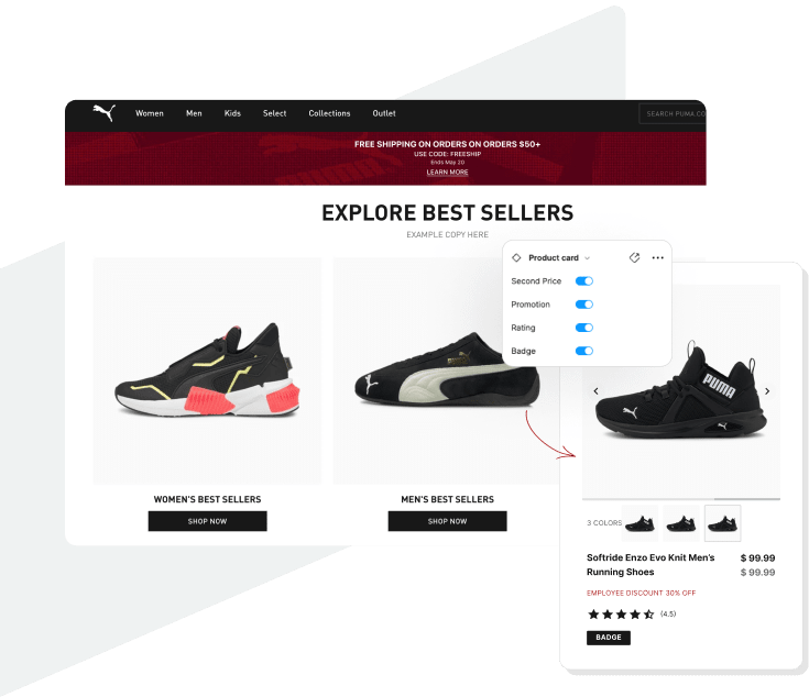
Creating a Shared Language
The design system is a set of standards and guidelines built to create a shared language and visual consistency across products and teams.
All components were documented and once the libraries were published, they were sent to the wider organization of designers and developers, who then provided feedback and highlighted any missing components or gaps.
Design. Code. Documentation.
Alongside the component library in Figma and React, we have also built a custom documentation site, using the same technology as the e-commerce platform.
By providing comprehensive documentation, the design system enables the regional teams and external partners to utilize components and build with cohesion and efficiency.
The Impact - Connecting Global Teams & Creating Dynamic Products at PUMA
The ImpactConnecting Global Teams & Creating Dynamic Products at PUMAOur ongoing work will allow design partners to reduce duplicate work, as well as ensure that resulting work will be more consistent across the brand. The Unified Design System will also serve as a central resource for things like guidelines related to site accessibility. When design partners have access to these guidelines, they will be able to avoid accessibility challenges and any confusion related to how to make sites accessible to all users.
Soon after the first styles and a small number of primitive components were published to Figma, other design teams started using the library and saw an immediate improvement in efficiency and collaboration between disciplines. As the system has grown, we now see not just design and development using it, but the potential of UX, SEO, marketing, and regional content teams benefiting from our work. The unified system for design at PUMA will allow progress to be made at scale and we’re seeing work done on improving user experience, content writing, and improved accessibility on the site.
20
Regional Websites
The workflow getting ideas into design and into production is significantly faster for the PUMA product team
Related Case Studies
See more of our work and different solutions we’ve created for our clients and partners